
Weekly Design Tools for 2020 – Week no.1 Neumorphism Generator
This year I wanted to do something different with our content and for our tribe. We are always discovering cool new design tools and resources that help with our workflow and creativity process, and I want to start sharing those with you!
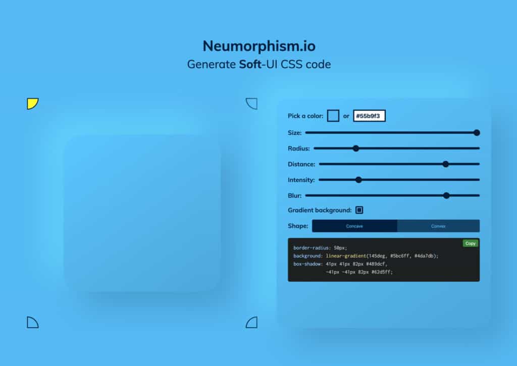
This week for our first tool is the Neumorphism CSS Generator. Neumorphism is one of the big talks of the design community as being one of the leading design trends coming into 2020. It is a hot topic right now, and it would be great to hear other’s thoughts. Drop them in the comments and enjoy having fun with this new tool!
What is Neumorphism?
Neumorphism is a new version or style of Skeuomorphism. Ok, I know that opens up a whole new question (and one I had to research and read a few articles on.) Basically, neumorphism is a style of design that mimics the real world. It is another way to add depth to an object.
In the last couple of years, we have seen box shadows used in many ways for web design trends. From images to info blocks, box shadows has been a great way to add depth and even help with making elements that need attention subtly stand out. And with the right hover effect, you can make elements appear to be ‘pushed down.’
Neumorphism takes this to the next level by making the depth look more life-like and detailed. By combining light and dark box shadows and a gradient background on an element, this gives a whole new, almost 3D like effect.
How to use Neumorphism?
The short answer, CSS. It is a combination of two box shadows, dark and light. Also, a gradient background on the object can add to the effect. Here is an example I made using markup and CSS from Web Cifar on Codepen and combined with the Neumorphic generator.
<html>
<style>
	.container {
	height: auto;
	display: flex;
	flex-direction: row;
	justify-content: center;
	align-items: center;
	padding: 30px;
	background: #55b9f3;
}
.neumorphism-1 {
	height: 150px;
	width: 150px;
	border-radius: 50px;
    background: linear-gradient(145deg, #5bc6ff, #4da7db);
    box-shadow: 30px 30px 60px #489dcf,
            -30px -30px 60px #62d5ff;
}
.neumorphism-2 {
	margin: 50px;
	height: 150px;
	width: 150px;
	border-radius: 50px;
    background: linear-gradient(145deg, #4da7db, #5bc6ff);
    box-shadow: 30px 30px 60px #489dcf,
            -30px -30px 60px #62d5ff;
}
.neumorphism-3 {
	display: flex;
	justify-content: center;
	align-items: center;
	height: 150px;
	width: 150px;
	border-radius: 100%;
    background: linear-gradient(145deg, #4da7db, #5bc6ff);
    box-shadow: 30px 30px 60px #489dcf,
            -30px -30px 60px #62d5ff;
	position: relative;
}
.neumorphism-3:after {
	content: '';
	position: absolute;
	height: 80%;
	width: 80%;
	background-color: transparent;
	border-radius: 50%;
	box-shadow: inset -3px -3px 7px #62d5ff, inset 3px 3px 5px rgba(94, 104, 121, 0.671);
}

@media screen and (max-width: 767px) {
   .container {
	display: block;
}
.neumorphism-1 {
	margin: auto;
        width: 200px;
        height: 200px;
}
.neumorphism-2 {
	margin: 50px auto;
        width: 200px;
        height: 200px;
}
.neumorphism-3 {
	margin: auto;
        width: 200px;
        height: 200px;
}
}
</style>
<body>
  <div class="container">
    <div class="neumorphism-1"></div>
    <div class="neumorphism-2"></div>
    <div class="neumorphism-3"></div>
  </div>
</body>
</html>
And here are the results:
The pros and cons of Neumorphism
The Pros
It looks cool! To me, from a design perspective, that has to be the biggest pro. It looks different, and it opens up even more possibilities of how you can make an app or a website look.
The Cons
From a UX perspective, it might not be the best thing to use. It should not be used as a call to action as it is very subtle and does not imply action. Then there are other variables to consider like the users’ screen resolution and quality and user age group. If a website’s goals are to convert sales for medical insurance and its target market is users 45-75, then obviously using neumorphism is not the style to go with.
Conclusion – Should you use Neumorphism?
I have gone through many articles, and I am also part of a fair share of UX & UI Facebook groups and hear the debate. And I see both sides, especially the UX side. After all, the design is not just about making things look good. It is about strategy, trying to achieve a goal, and tell a story. What it comes down to is how it is used.
If used correctly, neumorphism in a design can be slick. It can really make your design stand out and add some uniqueness. Personally, I dig it. I have been playing around with it and even use some in backgrounds on our website. And I can’t wait for the right project where it can fit into. It’s fun! But if not used right, and this goes for any design style, really, it can lead to an underperforming design. This is why learning design principles are so important.
You can find the Neumorphism Generator here.
I hope this article and Neumorphism Generator helps. Have fun designing, and If you find this helpful, then share to spread the word! ?