
Weekly Design Tools for 2020 – Week No.4 Icons with Flaticon
Welcome to my weekly series of design tools, where I feature tools I use in my workflow, and that can help you with yours. I am always on the lookout for new design tools and tricks and started this series to spread my findings in hopes it can help others. This week’s featured design tool – Flaticon! I have been using Flaticon for around 3 years now and is my #1 go-to for finding the right icons for my projects.
Icons are essential in today’s web design. And really everywhere when you stop to look at the world around you. For example, restroom signs. We expect to see an icon displaying for males or females. Elevators – we look for arrows. And so on. Icons are imagery that we identify every day, consciously and subconsciously, in the world around us.
And Icons are used in web design and help with highlighting a piece of content, a message, or a feature the designer wants to stand out. They help the website’s visitors identify primary areas on the site. And if done correctly can catch the attention of users where you want it to. The average user no longer reads but skims the webpage to consume content. And using icons, it tells the users to ‘stop and look here.’
What is Flaticon?
Flaticon has one of the most extensive libraries of icons that I have ever seen. And it’s website interface makes it easy and fast to use, saving valuable time when searching for the right icon and style for a design project. You can find the Flaticon platform on this link.
Flaticon’ s Top Features
1. There is a free version
This is great for those just starting off and for the non-professional creatives that don’t work full time in design, but like to make cool stuff. Usually, free versions have limitations that make platforms unusable, but not Flaticon. I used the free version for my first year and got so much out of it. I never had to go anywhere else for my icons. With the free version, you can still save icons to your library, have access to a majority of icons, and can download all files.
This is great because icons are not just for the professional creative, but for all creatives. The paid version unlocks the premium icons and requires no author attribution on websites.
2. Massive library of icons
Flaticon has the largest selection of icons I have found. They even claim to add 60,000 new icons every month! Just about any icon style can be found here. And if you design your own icons, you can submit them to Flaticon and get paid for downloads of your icons.
3. You can save your icons
This is one of the main stands out features to Flaticon. Being able to save and manage your icons. Before I was using Flaticon, I would be downloading a crazy amount of icons packs and trying to sort through them in my computer files. This ate up a lot of time and created clutter in my computer files.
They really nailed this feature down. When browsing icons in Flaticon, you can click the ‘Add to collection,’ and it goes to your icon library, which is in the right drawer. This way, you get a visual and can compare the icons you are considering for your design. Being able to see all of your icons together makes it easier and faster to compare and choose the right one. And no more downloading heaps of files and cluttering up your computer.
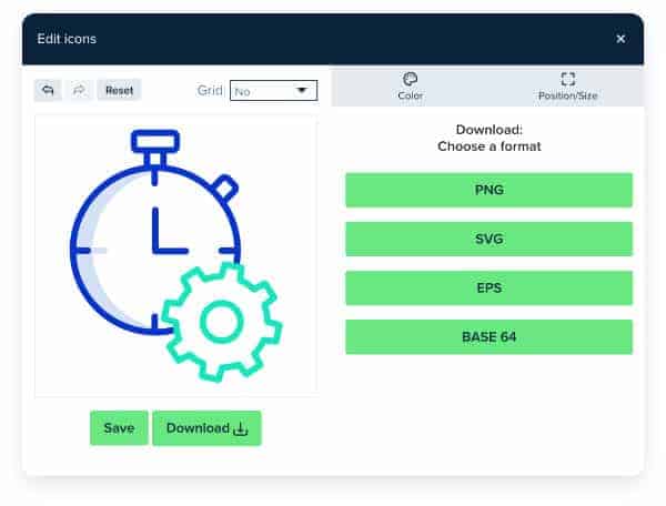
4. Multiple file options
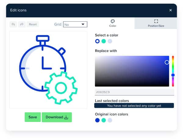
Every Icon has the option to download PNG, SVG, EPS, PSD, and Base 64. This is incredible! You can basically use them anywhere. Also, when downloading your icons, you have the options for changing colors and can add any color so you can match your design just right.
5. Icons are customizable
This is one of my favorite features. And following up on the multiple file types, having SVG and EPS allows designers to make vector changes and additions to the icons. I am a Sketch App user and normally download SVG files, then on Sketch, I make my changes. Sometimes I will add gradients, add my own shapes, or even combine icons to create my own unique icon. And the same can be done in Illustrator. Because they are vector, it makes them a good starting point for those that like to get extra creative and add their own touch.
6. Search and filter
This is where my workflow has increased in speed and productivity since switching to Flaticon. Between the search and filter and the icon library, finding the right icon can take minutes instead of hours.
7. Download packs
Most icons come in packs. This is helpful to keep a consistent style throughout your design. Once you find the right icon and style, you have the rest in the icon pack that can be used.
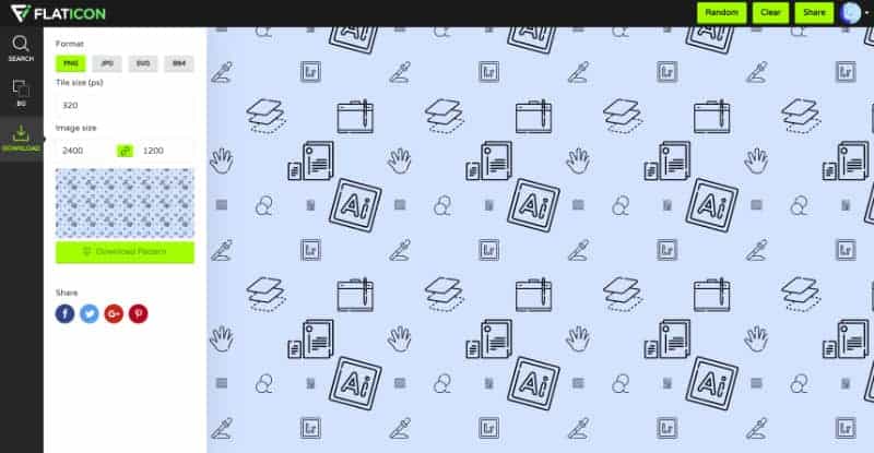
8. Pattern generator
This is one of the newer features added. You can create a background style with icons that are really easy and fast. I don’t see this style being used much in web design but maybe in other stationery designs. You can find the pattern generator here.
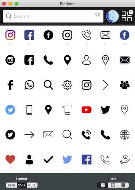
9. Mac app
This is only availed with the paid version and is perfect when creating rapid designs or need an icon quickly. I personally use this daily. If I need a right angle or a Facebook icon, I can drag and drop it from the app to my design on Sketch. Saves so much time!
10. Saves time
Time is valuable. And before I was using Flaticon, I spent hours on Google, searching and downloading junk, trying to find the right icon. Now it is fast and easy, and that really is the number one feature with Flaticon.
Conclusion
I have been using Flaticon in my daily workflow for three years. And one of the things I am most impressed with is their constant updates and upgrades to their platform. They are continuously improving their user interface and making it easier to use icons. Before I discovered Flaticon, I was Google searching for free downloads and going from site to site, spending lots of time and putting my computer at risk downloading icon packs and just hoping they would work.
I hope this helps you in your workflow and in your next projects. If you found this article useful, please share and drop your comments below.